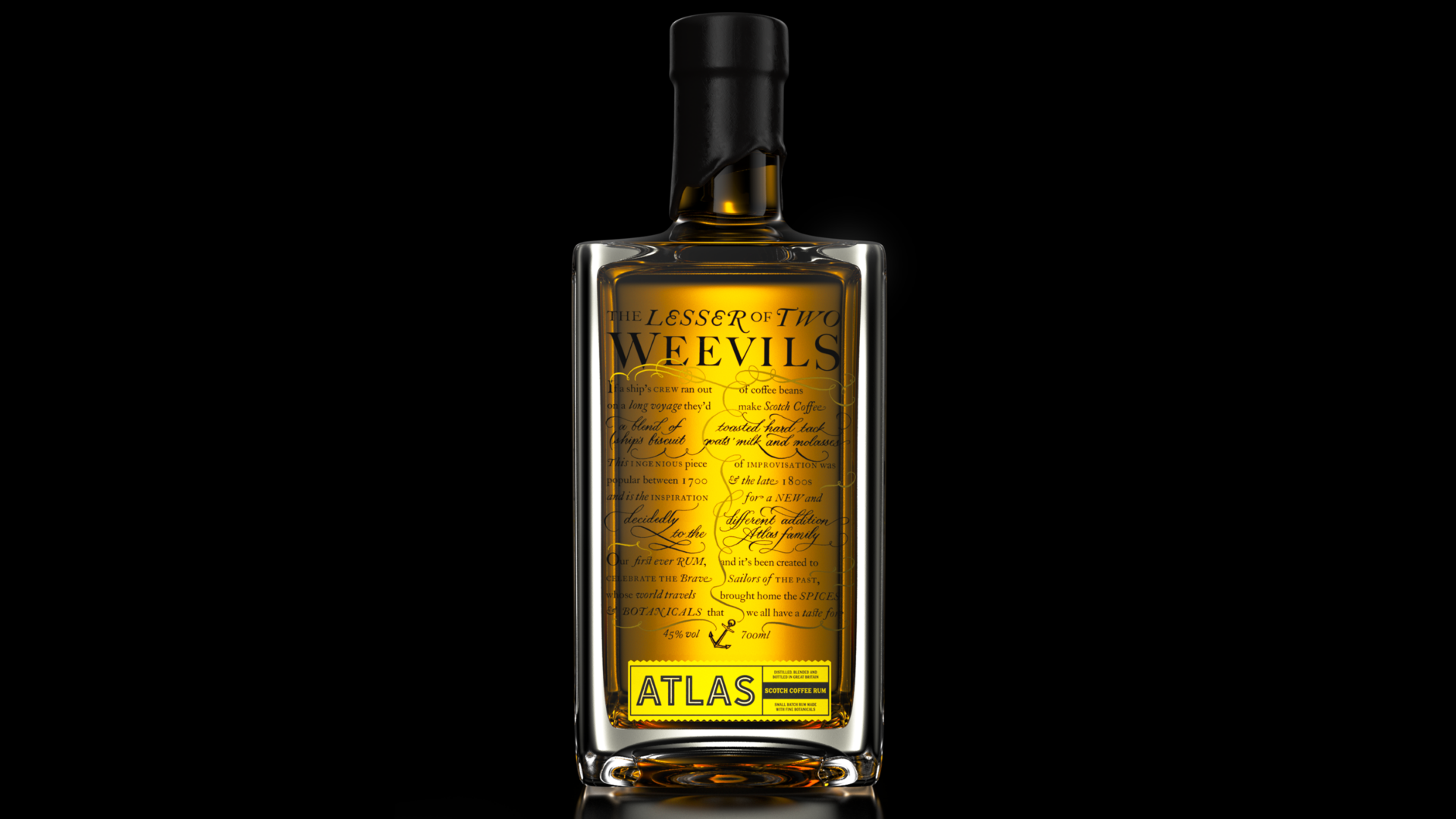
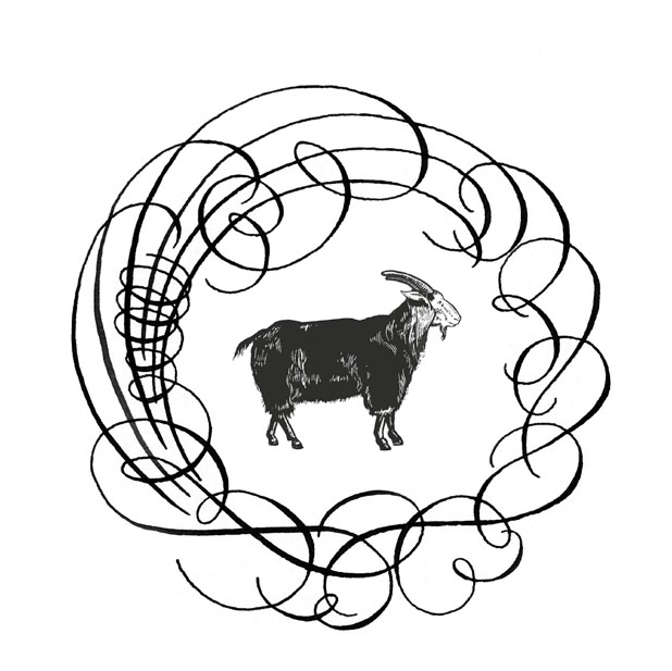
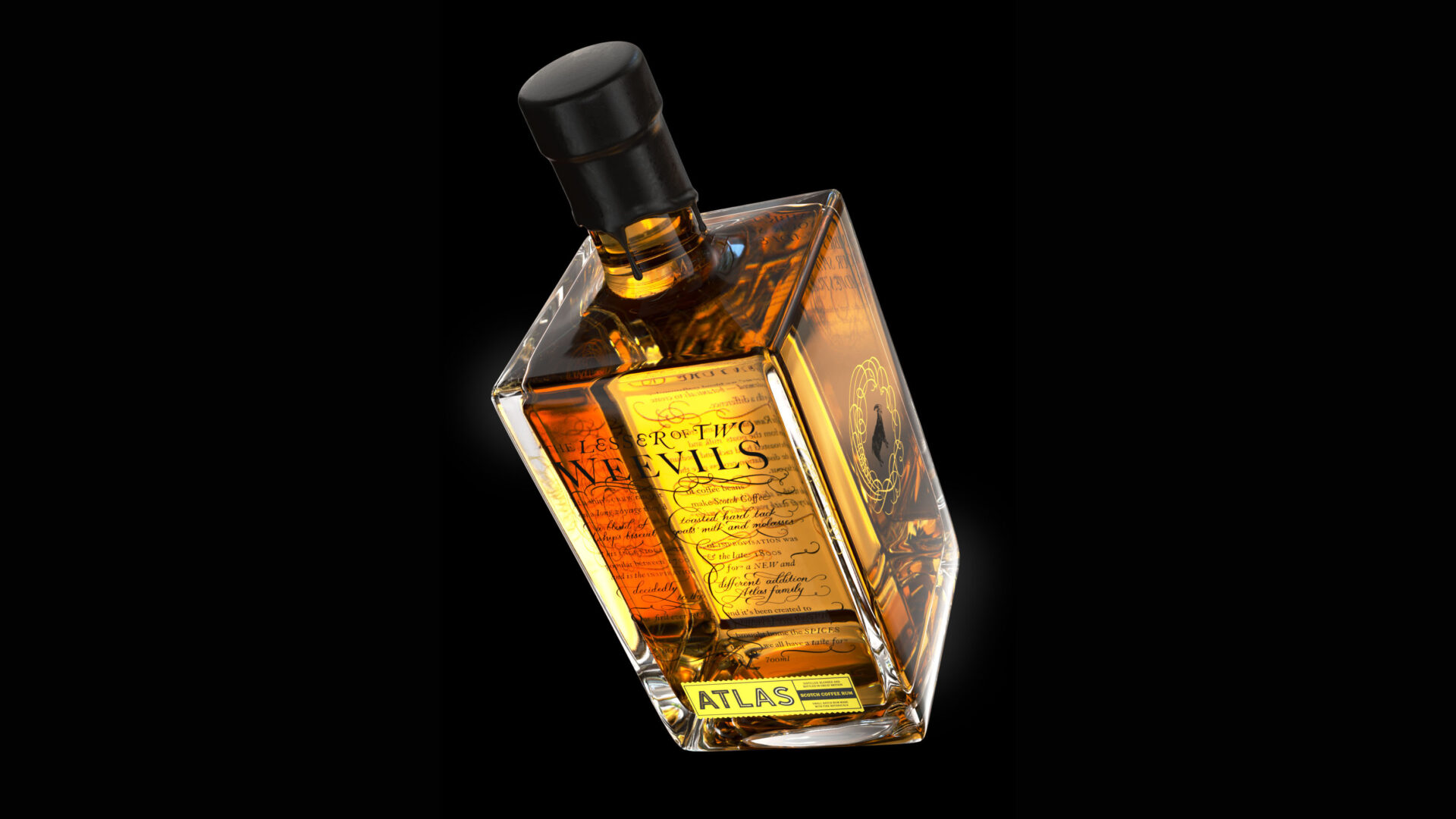
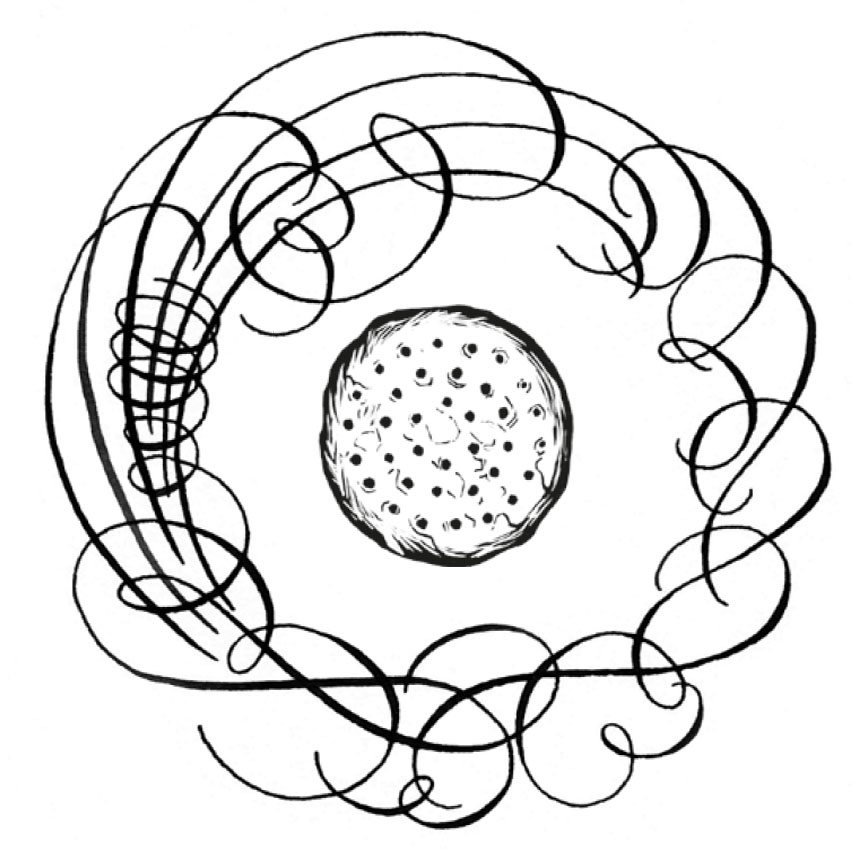
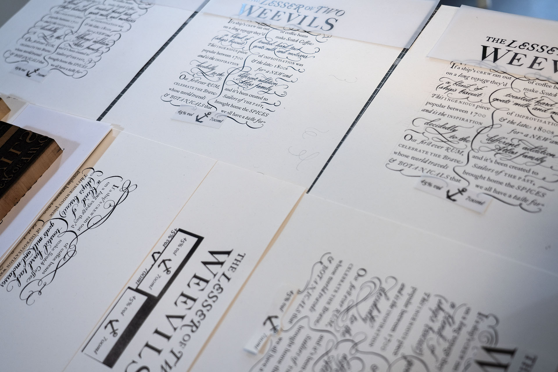
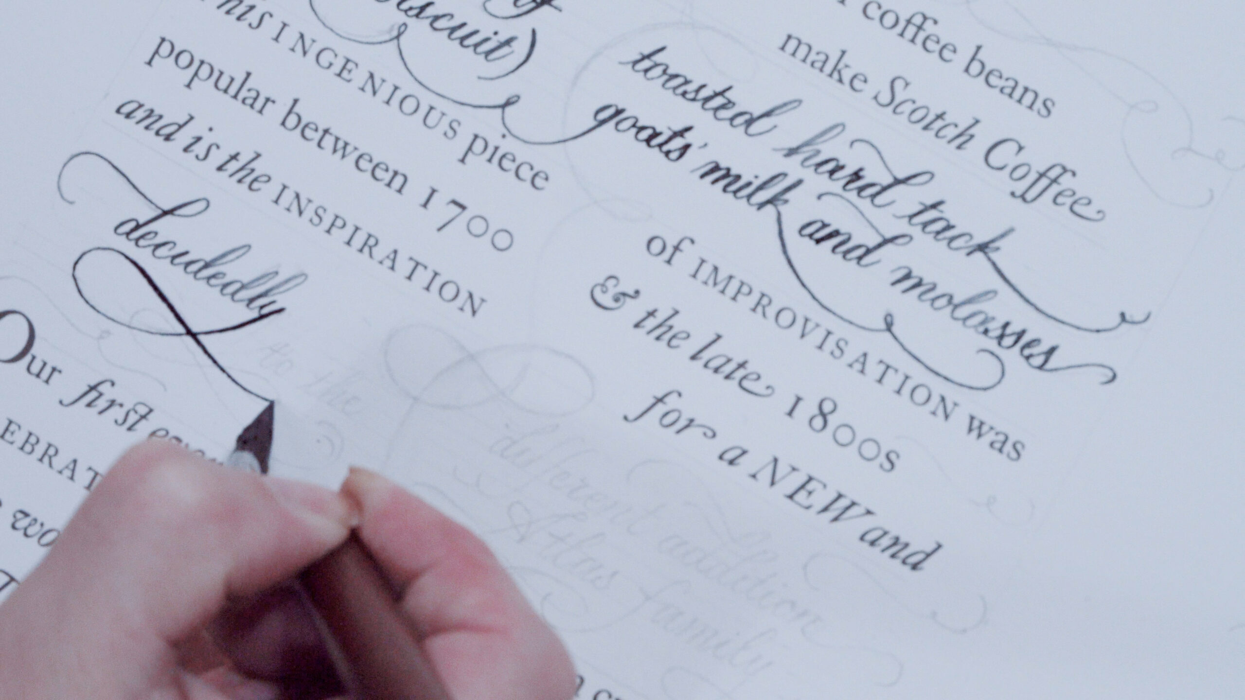
If a ship’s crew ran out of coffee beans on a long voyage they’d make Scotch coffee – a blend of toasted hard tack (ship’s biscuit), goats’ milk and molasses. This ingenious piece of improvisation was popular between 1700 and the late 1800s and is the inspiration for a new – and decidedly different – addition to the Atlas family.
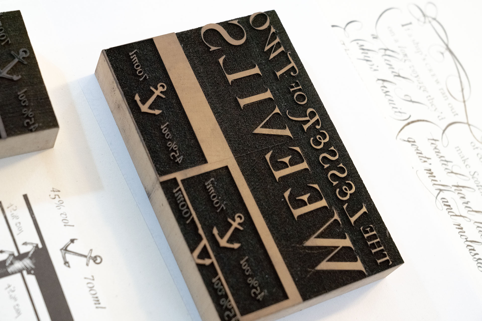
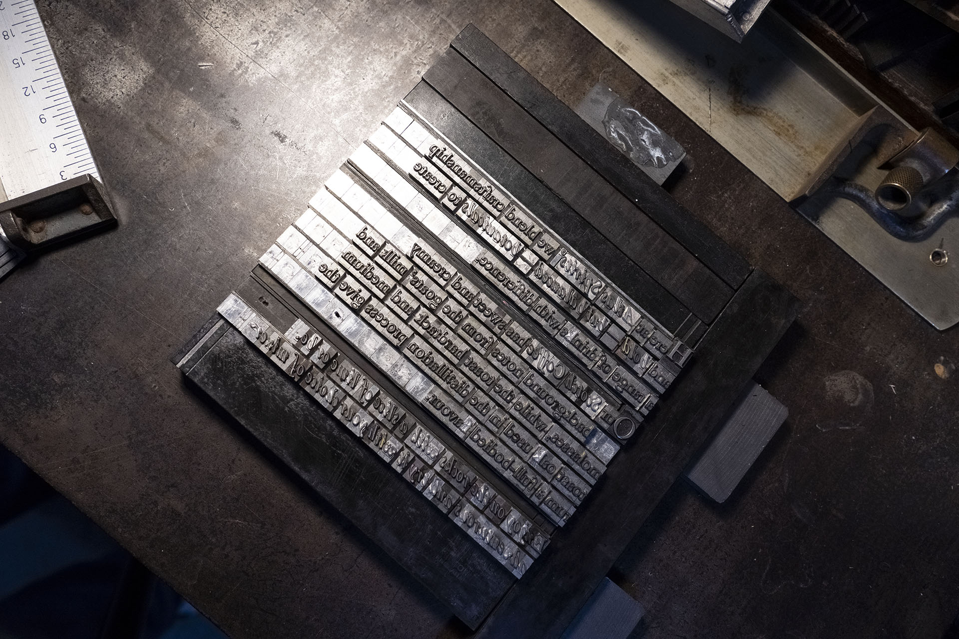
We created a traditional typographic approach that used the same movable metal type that existed in the 1700s. This font of movable type contained unusual characters that are lesser in modern digital typefaces.
The type setting and design was also inspired by period typographic pieces, like The Declaration of Independence. This combination of traditional printing, typography styling and distinctive characters gave a strong visual approach that helps to tell the rum’s story. The typographic style was then coupled with sea like flourishes and calligraphy. Wood engraved spot Illustration engravings were then cut and printed to add embelishments to the sides of the bottle.